Sunday, 15 January 2012

My Mentor -- Berenice Abbott

“Photography can never grow up if it imitates some other medium, it has to walk alone, it has to be itself.” - Berenice Abbott lived her life around this quote.

Berenice Abbott was born in Springford, Ohio on July 17th 1898. She lived a very normal childhood. Her artistic lifestyle began when studied at Ohio State University. After studying at Ohio State she moved to New York City to study journalism. Very quickly she found that this was not the career for her, so she decided to try sculpting and painting. She discovered this was a much better career path.

She moved to Paris, France, in 1921 where she worked as a mentor with sculptor Emile Bourdelle. After working with Bourdelle, Abbott was introduced to surrealist photographer Man Ray. Ray was very influential in the development of her art career, sparking lots of interest in the photography world.

After working with Man Ray for a while, she decided to open her own studio in Paris. Shortly after, she hosted her first solo exhibition in 1926 at Au Sacre Du Printemps Gallery.

After her first exhibition she decided to pack up and move back to New York City where she had a big influence on the Depression Era. Abbott is most commonly known for her photographs of the neighbourhoods, street life and architecture during the depression in New York. 

These photographs are featured in a book entitled ‘Changing New York’ published in 1939, which outlined the struggles of the depression.

Berenice continued with photography into her later years of life until her death on December 9th 1991, in Monson, Maine. 

----------

Berenice Abbott’s photographs provide us with a strong visual representation of the diversity during the Depression Era. She chose to photograph New York City. This was not her initial intention but during her three-week trip to New York City she loved it so much she decided to stay. She was intrigued by the contrast between the wealthy and the utterly poor and decided it needed to be captured. She also believed that the only medium that qualified for this undertaking would be twentieth century cameras.

Tri Boro Barber School, 1935
“Tri Boro Barber School” is one of Berenice’s most well known pieces. This image, captured in 1935 on 264 Bowery St, Manhattan, really represents her style. She photographed hundreds of storefronts, as a way of showing people the past, capturing the differences between today and yesterday. It shows in the picture that times have truly changed. A hair cut in 1935 cost 10 cents where as today it costs about 300 times that. What is truly incredible about this picture is her way of capturing such strong contrast in the picture, including the painting on the building to the items reflected in the storefront.


1929
Another popular piece of Abbott’s is a picture taken on West Street, in Manhattan. This was taken in 1929 after she arrived in New York. This photograph has both beautiful contrast and composition. I love the angle that this image was taken on as it really shows the depth of the city. The horse drawn vehicles and open back delivery trucks demonstrate what life was like in the 1920’s and 1930s.


House Number 8, 1936
Finally, one of her other popular pieces is of House Number 8 on Fifth Avenue, 1936. This picture highlights the disparity between the rich and the regular class people. A rich family owns the right side of the house as is clearly defined by the clad marble on the exterior. The middle class family’s whose home is clad with red bricks. I also love the perspective of this photograph showing the full exterior of the homes. Overall, I love the contrast between the two and think that this nicely demonstrates the different classes of wealth at the time. 


After completing some research on how she composed her images and reviewing some of her beautiful collections of work I was really hooked on her photography. Her pieces are absolutely beautiful. Once I had decided on having Berenice Abbott as my mentor assignment, I had the difficult task of mimicking her style. 


----------

To begin the assignment I went for multiple walks with my camera. I wandered through quieter and busier areas of downtown Oakville. I was in search of beautiful buildings, as we are no longer living in the depression so shooting architecture was my only option.

I took many pictures of buildings I thought were stunning until I came across the one I knew was going to be my project. I ended up finding this subject at the corner of Trafalgar and Dunn. This residential property has a more traditional style architecture, which looked beautiful in the setting sun.

I set my camera at a f16 with a shutter speed of 1/60th to take this photograph. Once I had my negative I chose to overdevelop the film to make the photograph have even more contrast. This worked out great mimicking the style of Abbott. Next I developed the negative into a positive print and I was amazed at the detail in the picture! Here is my final result:


Canon 35mm, f16, 1/60th 

Bibliography:

Friday, 23 December 2011

You WANT me to break the rules?

We have been continuously taught how to compose a proper photograph. We are given guidelines and rules to live by when taking our photos. Now you want me to forget those? Not quite.

Breaking the rules of photography sounds incredibly easy but in fact it is extremely difficult. You still have to think about the rules and how you can 'adjust' or 'tweak' them to make them break the rules. This became a challenge for me and took multiple tries to get an image that is still beautiful yet breaks the rule of composition.

Here are a couple that I am proud to present:

 Taken with a nikon D3000, 1/125 Shutter Speed and f/5.6 Aperature.

 Taken with a nikon D3000, 1/8 Shutter Speed and f/4.5 Aperture.
  Taken with a nikon D3000, 1/10 Shutter Speed and f/5.6 Aperture.

Thursday, 22 December 2011

Silk Screening Laptop Case

For my third medium I chose to use the silk screening method.

Steps for prepping a screen:

I started by selecting the image I wanted to use. My picture was a simple design of a chair I photographed in the corner of cement walls. I then transfered it to an acetate, allowing the sections that would be white to be clear and the blacks remain black.

The next step was to prep the screen. I took a large wooden screen and stretched and stapeled thin fabric onto it. This can be tricky because it would be very tight. You then take the screen and apply emulsion to it. With this step it is crucial that you apply the thinest layer you can.

Once the screen is evenly covered you place the screen in a dark cupboard or room for two days. In my case I placed it inside a cupboard. This allows for plenty drying time.

After two days you take the screen and acetate and place both on the light desk. This will expose the screen burning the image into the screen. I recommend 12 minutes for the exposure.

Next comes the tedious step. Washing. I spent a total of 40 minutes washing my screen, to ensure that it had been thoroughly washed, as you cannot wash once the screen has been used. After the screen has been washed it is ready to use!

Using the screen:

My first step was to tape the paper down onto the desk so that it wouldn't move while screening.


My screen has two screenings that can be done on top of one another to create a picture with more depth, so I did the first screening, followed by the second screening.


             This was the final result:


To make the screen into a product I decided to put it onto a laptop case. I repeated all of the steps above with an adjustment in the colour choice. I feel that the result really enhances the look of the laptop case giving it a lot more interest.


Some of the challenges I found whilst completing this process were difficulties in washing the screen after the exposure to light, lining up the two screenings (can be really challenging to get them to line up perfectly) and making sure the laptop case didn't move or smudge whilst screening.

Overall I enjoyed this alternative process and will continue to do many more silk screenings in the future.

Monday, 12 December 2011

Double Exposure? No... TRIPLE EXPOSURE

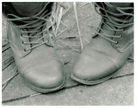
When flipping through my negatives from my trip to Toronto, mentioned in the last post, I came across this photo of a pair of boots:


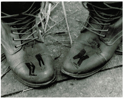
It led to me thinking about how I had been taught a double exposure. Then that thought spinning in my head ended it up with me doing a triple exposure, thinking it would be absolutely awesome if I put a similar image on each boot. So I remembered I had taken a couple pictures of a couple skating.

I did test strips to find a good exposure time for the two images of the skaters, and then found a good time for the boots. 

I then burned and dodged the spots where the photos would go, switching between three enlargers. (Not an easy task!) This was frustrating at times as one wrong move, like laying the paper down slightly out of line would wreck the entire composition.

After numerous times of exposing and developing, finding the right times and placements, I came up with a composition I am truly proud of:


The Adventures of Creating a Cyanotype

When I was introduced to the idea of a blue photograph which is developed by the sun, my mind was immediately triggered. I thought this is amazing. So I started on a mission to find a good picture to use for such a unique process. I couldn't make up my mind. I ended up choosing two photos I took on a trip to Nathan Phillips Square in Toronto on Nov 25th. The first one was of a antique Harley Davidson headlight and the other of my classmates in Graffiti Alley.

Inverted Image Used on Cyanotype
Once I had the photos selected, I was able to start the process of developing a cyanotype. I started by mixing equal parts Ammonium Iron Citrate and Potassium Ferricyanide. When the solution was mixed, I used a paint brush to spread the liquid over the sheets of watercolour paper. (This ends up looking bright green.)

While waiting for the solution to dry, I scanned my original photographs, which I developed in the dark room, and on the computer inverted the colours to create a negative from the positives.

After waiting 20-40 minutes to allow the cyanotype fluid to dry, I was
able to place my acetates on top.  These to sheets get sandwiched by two plexiglass.

Inverted Image Used on Cyanotype
Now it was ready to expose! Unfortunately I did not have very good weather the first time I tried this, so the image did not appear, even though I left it to be exposed for a very long time. So I tried again the next day. Same weather, same results. And same the following day. By the fourth time trying I found this to be very irritating and wondering why I am putting myself through this. But I continued. The weather was great that day! Nice and sunny. The cyanotypes came out quite beautiful but I was still not content with the end result as they started to fade quickly.

With decent results I told myself, try it one more time. The next day was the same beautiful weather so I did the process all over again. The results were amazing this day! This is what the final result was for each of them:


Canon 35mm Film Camera
Canon 35mm Film Camera 

I think that there was one cliche line that was really proven to me the week that I spent working on this medium. "With persistence comes great results". There were points where I was looking down the list thinking of the other mediums I could select, to replace this medium. But I am glad I continued through with it, and now it is one of my favourite processes!

Sunday, 13 November 2011

Proper Studio Lighting

When I went about completing my final task of proper studio lighting, it took me a second. I thought what really is proper studio lighting? I didn't know that there was really a "proper" way to go about studio lighting.


I further learned that the main component to proper studio lighting is the positioning of light. I learned you can place it behind for an almost halo light appearance, place it to the side for a half lit face, or put it below for a scary appearance. You can also use multiple lights for different effects.


For my project I decided to use the techniques of backlighting, scary lighting, and bottom spot lighting. I also wanted to capture different expressions, such as relaxed, content and unhappy. This is how it turned out:

Nikon D3000, 1/15th, f/5.6


Nikon D3000, 1/15th, f/4.5


Nikon D3000, 1/13th, f/6.3

Friday, 4 November 2011

Experimenting with Light.

When experimenting with light there are endless ways of going about it. Some mix fluorescent and tungsten, moonlight and flash, and many more! In my case I chose to mix tungsten outdoor lights in the background, as well as natural moonlight, since this was shot at night. To make the ghostly figures appear I used my third type of light, being a flash. Here is what it turned out like:

To accomplish this affect I set my aperture to f/6.3 with a shutter speed of 30 seconds. The long exposure allowed me to pop a flash about every three seconds, while my subject moved across the picture.

Overall I was able to accomplish everything I was looking to, with a lit background and ghostly figures. This has definitely been my favourite so far!