Friday, 28 October 2011

Renaissance Imitation

The renaissance was an period in which italian painters used various types of techniques. The renaissance covered a vast period from the 14th to the 17th century.
First off, they liked to use perspective in their pieces. In particular one point perspective. One point perspective was first discovered by Filippo Brunelleschi, and italian architect whom built the duomo. 
Another technique which was popular at the time was Sfumato. Sfumato was originally discovered by Leonardo Da Vinci. Sfumato is a technique that incorporates the blurring and softening of harsh lines and colours. Often used by painters for softening faces. One artist who used this technique was Johannes Vermeer in his painting for The Girl with the Pearl Earring.

The Girl with the Pearl Earring features a young woman in a traditional european outfit including a blue Turkish turban. Some of the things that make this painting successful, are its uses of principles and design. His use of a black background makes all of the colours pop in the painting. On the topic of colours, Vermeer used the fabulous technique of adding value to the piece, which in turn makes her look as though she is sitting right infront of you. Finally his use of rule of thirds adds intrest and pulls the viewer in to look more at the details. 

For my renaissance substitution piece I selected The Girl with the Pearl Earring because of its intriguing features outlined above. About the process, I looked at the piece for a while trying to decide who would best suit the position for replacement and then I realized the model for this piece is around me everyday. My sister seemed to look identical to her. Once I shot an image of her against a blank wall, I dropped it into photoshop and played around with the features. This was the final result :


Thursday, 20 October 2011

Painting with Light

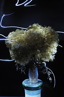
When I heard the term, Painting with Light, I was immediately intrigued in this assignment. I thought to myself I can use my 'creative liscence' to experiment with this unit. I decided the best way to go about composing this assignment would be to use a small but powerful keychain light. I set the shutter speed to be open for 30 seconds, to allow me to compose the entire picture. On deciding what I was going to compose, most of the concepts were sporadic spurs of the moment ideas in which depicted what I was thinking of. For example the picture in which looks like lightning was inspired by the fact that I love storms, and others such as the cartoon sitting on the stairs had no specific meaning to them other than the fact that I found them interesting. Here are some of the things I produced:


This effect can be accomplished by using an aperture f/6.3 and a shutter speed of 25seconds, allowing me enough time to paint in the light. The only difference in settings between pictures is the depth of view each picture has.

Overall this assignment has given me a NEW way to look at the options I have when taking a picture. It has shown me that taking a picture can be enhanced with the experimentation of light.

Tuesday, 11 October 2011

Name Assignment

For our second project, we had to experiment with a digital SLR camera. 
When I heard this I thought to myself, this is going to be extremely easy, as I have used a DSLR Nikon D60 and D3000 for the past few years. ...... Well I was wrong.

This project turned out to be very challenging. It made you look at everyday life in a different way. Looking for letters made out of tree branches, turning a brown bag with handles into the letter 'm'. 

It sent myself, and probably all of us in the class, a message telling us that the best photos and images are not planned or staged or fabricated. All of my 'letters' I stumbled across when going about everyday life, such as the weekend at my cottage, the walk downtown oakville and just wandering around my house. A great example of this is the second 'n' which I came across on the beach at my cottage, after the deer had been there in the morning.

When trying to tackle this assignment I thought it could never be complete. Each of my letters were different sizes, some were overexposed, some were underexposed, others just could not be used. But with the help of a little photoshop all of these problems were gone, and I was left with a project I was proud of: